

If you’re comparing ember vs gold, the main difference comes down to the kind of warmth each color suggests. Ember usually brings to mind glowing coals and deep orange or reddish tones, while gold suggests a warm yellow shade inspired by the precious metal. Both colors belong to the warm side of the spectrum, but they create different visual effects.
The distinction matters when you’re choosing paint, clothing, makeup, jewelry, website colors, or decorative accents. A deep ember shade can add warmth and drama to a room, while gold can introduce brightness, elegance, or a metallic finish. Still, neither name points to one exact color in every product line.
The best way to tell them apart is to look at their undertones, brightness, finish, and intended use. Once you understand those differences, you can choose the shade that fits your project instead of relying on a color name alone.
Learn the difference in principal vs principle Which Word Is Correct.
Quick Answer
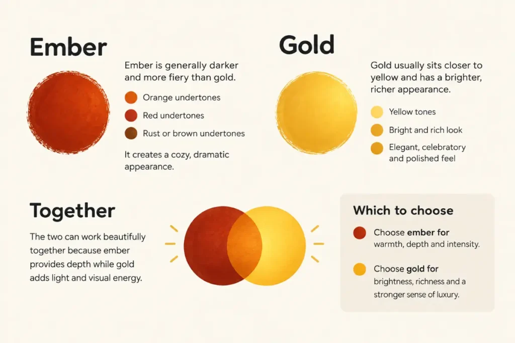
Ember generally describes a deep, warm shade inspired by glowing fire, often featuring red, orange, copper, or brown tones. Gold usually describes a yellow or yellow orange shade associated with the precious metal and often has a bright or metallic appearance. Ember tends to look more fiery and earthy, while gold often looks more luminous and decorative. Exact shades vary by brand and product.
Quick Comparison of Ember and Gold
Ember takes its name from the small pieces of wood or coal that continue to glow after a fire loses its flames. Those glowing remains can appear red, orange, coppery, or nearly black around the edges. As a color name, ember draws on that mixture of heat, depth, and earthy warmth.
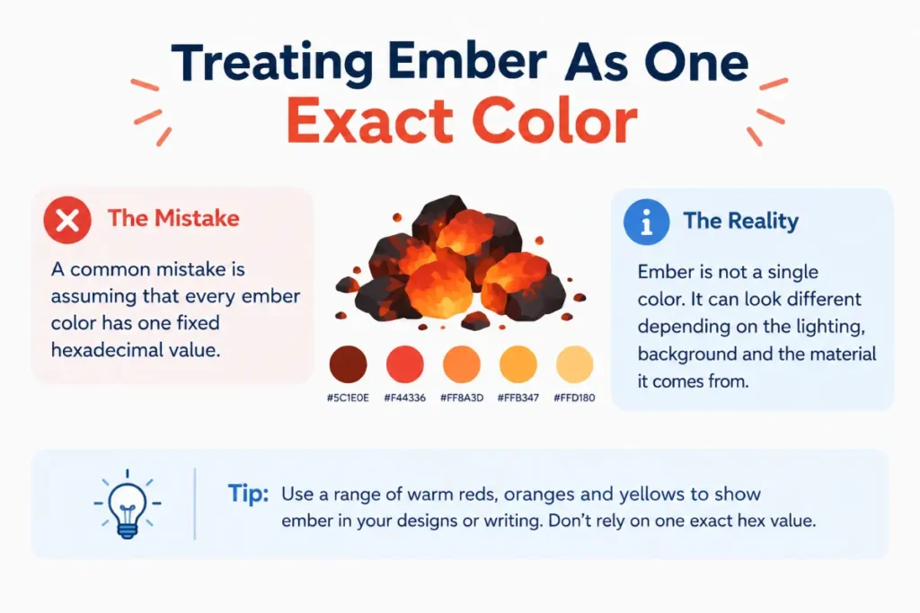
In design, the term often describes a rich orange red or a dark, warm shade with brown or copper undertones. However, there is no single universal ember color. One paint maker may use the name for a muted burnt orange, while a cosmetics brand may apply it to a reddish brown or shimmering copper shade.
The visual character of ember
Ember often looks grounded and intense. It can bring to mind a campfire at dusk, glowing charcoal, autumn leaves, or the last light of a sunset. Its deeper tones can make a space feel cozy, while brighter versions can add energy and draw attention.
The final effect depends on the shade and the surrounding colors. A dark ember shade against cream can feel rich and comfortable. A vivid orange red beside black can feel bold and dramatic.
Common uses for ember
Ember works well when you want warmth without relying on a bright yellow tone. In home design, it can add depth to cushions, accent walls, rugs, and decorative objects. In clothing, it can provide a strong seasonal color that works especially well with neutral shades.
Makeup brands may use Ember as a shade name for eyeshadow, lipstick, blush, or nail polish. In digital design, it can help create a warm visual identity for a food business, outdoor brand, or creative project.
Always inspect the actual sample before buying. The name suggests a color family, not a guaranteed match across different products.
What Gold Means as a Color
Gold refers first to a precious metallic element. Its familiar yellow appearance also gives the word its color meaning. In everyday descriptions, gold usually suggests a warm yellow shade, sometimes with orange, brown, or amber undertones.
The word can describe a flat color, a metallic finish, or an object made from the metal. These meanings overlap, but they are not identical. A gold colored plastic object may look yellow without reflecting light like actual gold metal.
The visual character of gold
Gold often appears bright, rich, and warm. Its familiar association with jewelry and valuable objects can give a design a sense of celebration or elegance. Pale gold shades feel softer, while deep antique gold can look earthy and understated.
Metallic gold creates an extra visual effect because its surface reflects light. Depending on the angle and lighting, it may look brighter in one area and darker in another. A flat yellow gold color does not automatically produce the same effect.
Common uses for gold
Gold is popular in jewelry, watches, decorative hardware, gift packaging, clothing, and special occasion designs. It can also appear in logos, invitations, product labels, and digital artwork.
In interiors, gold accents can brighten a neutral room or add contrast to dark furniture. In fashion, gold accessories can complement black, navy, cream, burgundy, and many shades of green.
Gold can also describe a level of achievement, as in a gold medal. In that context, the word refers to an award or rank rather than simply a color.
The Main Differences in Appearance
The easiest way to separate these colors is to compare their dominant hues and overall visual effect. Ember usually leans toward red and orange. Gold generally leans toward yellow and yellow orange.
That difference may seem small on a screen, but it can change how an entire design feels. A reddish orange can make a room or outfit feel intimate and earthy. A yellow gold accent can make the same setting feel brighter and more formal.
Hue and undertones
Hue describes the basic color family you see. Undertones are the subtle colors that influence the overall appearance.
Ember commonly has red or orange undertones. Some shades contain enough brown to look muted or smoky. Others are vivid and bright, with a strong orange red appearance.
Gold commonly has yellow undertones. Some versions lean toward orange, while others contain brown or pale cream qualities. Antique gold tends to look deeper and more subdued than bright yellow gold.
Brightness and depth
Ember often appears deeper than a traditional bright gold. This is a tendency, not a fixed rule. A pale ember shade can be lighter than antique gold, and a dark gold shade can look richer and more subdued than a bright ember orange.
When choosing between them, compare lightness as well as hue. If you need a warm accent that stands out against a pale background, a brighter gold may work well. If you want a darker accent that adds depth, a deep ember shade may fit better.
Texture and finish
Neither color requires a specific finish. Ember can appear matte on a painted wall, glossy on a car, or metallic on an eyeshadow palette. Gold can also appear matte, satin, glossy, or metallic.
The important distinction is that gold has a strong association with metallic reflection, while ember does not. A flat gold shade and a reflective gold finish can look quite different, even when the underlying hue is similar.
Mood and visual impression
Color associations depend on personal taste and culture, but some patterns are common.
- Ember often suggests fire, energy, warmth, autumn, and natural materials.
- Gold often suggests celebration, value, sunlight, prestige, and decoration.
- Dark ember can feel cozy or dramatic, especially beside neutral colors.
- Pale gold can feel delicate and understated, while bright metallic gold can draw attention.
Use these associations as a starting point rather than a strict design rule. The shade, material, lighting, and surrounding colors all influence the result.
Which Color Should You Choose
The right choice depends on the effect you want and the material you’re using. Neither shade is automatically better. Each serves a different purpose, and both can work beautifully in the same design.
Choose ember for warmth and depth
Ember is a strong option for projects that need a warm, earthy, or fiery appearance. It can add character without the bright yellow quality often associated with gold.
Consider ember for these situations.
- You want a rich orange red accent in a living room.
- You prefer warm autumn colors for clothing or accessories.
- You need a bold makeup shade with copper or reddish undertones.
- You want a brand palette that suggests fire, energy, or the outdoors.
- You prefer an earthy look instead of a shiny metallic effect.
For example, ember cushions can bring warmth to a beige sofa without making the room feel overly bright. An ember eyeshadow can also create a warm look that feels deeper than a pale gold shimmer.
Choose gold for brightness and elegance
Gold is a useful choice when you want warmth with a brighter or more decorative appearance. Its connection to precious metal makes it especially familiar in jewelry, formal accessories, and celebratory designs.
Gold may suit these situations.
- You want jewelry or accessories that stand out against a dark outfit.
- You need decorative accents for a formal event.
- You want to add a warm highlight to a neutral room.
- You prefer yellow or amber tones over red and orange.
- You want a metallic effect that reflects light.
For example, gold cabinet handles can brighten dark kitchen cabinets. Gold lettering can also make an invitation feel more formal, especially when the finish reflects light.
Can you use ember and gold together
Yes. These colors can complement each other because they share a warm visual character. Ember brings red and orange depth, while gold adds yellow warmth and can introduce a reflective highlight.
The trick is to give each shade a clear role. Use ember as the main color and gold for small accents, or reverse the arrangement if you want a brighter overall look. Cream, charcoal, dark brown, and deep green can help balance the palette.
If both shades are highly saturated, the result may feel intense. Try a muted ember with antique gold for a softer effect, or combine a deep ember with a restrained metallic gold for more contrast.
How Color Names Work in Design
Color names are useful because they help people communicate a visual idea. However, names such as ember and gold do not guarantee a precise match across manufacturers.
A paint company may give a reddish brown shade the name Ember. A fashion brand might use the same name for a copper orange fabric. Both are using the word to suggest warmth, but the actual shades may differ.
Gold works the same way. One manufacturer may offer a pale champagne gold, while another may sell a saturated yellow gold or a dark bronze gold.
Why the exact shade matters
A color label cannot tell you everything about a product. You also need to consider the material, lighting, finish, and surrounding colors.
- For paint, view a physical sample in the room where you plan to use it. Natural daylight and warm indoor bulbs can make the same shade look different.
- For clothing, check the fabric in natural light when possible. Satin and other reflective materials can appear brighter than matte fabrics.
- For makeup, consider the base color and shimmer. Two products with the same shade name can have different undertones and finishes.
- For digital design, use the actual color values rather than relying on the written name. A hexadecimal color code or another defined color value gives you a more precise reference.
- For jewelry and metal finishes, check the material and surface treatment. A gold colored finish does not automatically mean the item contains solid gold.
These steps help prevent a common mistake: buying two products with similar names and expecting them to look alike.
Color Theory and Practical Pairings
Both shades fall within the warm color family in ordinary design discussions. Warm colors can create a sense of energy and closeness, especially when paired with other warm neutrals. Yet their different undertones make them useful in different combinations.
Colors that pair well with ember
- Cream and ivory soften the intensity of ember and create a comfortable contrast.
- Charcoal and black make a deep ember shade stand out and give it a more dramatic look.
- Olive and forest green balance orange and red tones with a cooler natural color.
- Beige and warm brown create a quiet, earthy palette.
- Navy blue contrasts with orange based shades and can make an ember accent more noticeable.
These combinations work in interiors, clothing, branding, and visual artwork. The best result depends on how much of each color you use.
Colors that pair well with gold
- Black creates a strong contrast with bright or metallic gold.
- Navy blue provides a deep background for yellow gold accents.
- Emerald green gives gold a rich, traditional pairing.
- Cream and white create a lighter and more understated appearance.
- Burgundy combines with gold for a warm palette often used in formal settings.
Gold can become visually dominant if you use too much of a bright metallic shade. Small accents may create a cleaner result than covering every surface in gold.
How lighting changes both colors
Lighting can alter the way warm colors appear. Under a warm light source, ember may look more orange or red, while gold can look richer and more yellow. Cooler lighting can make some warm shades appear less intense.
Surrounding colors matter, too. Ember beside a strong yellow may appear redder, while gold beside orange may seem more yellow by comparison. This is a normal effect of visual contrast.
For a project where color matching matters, compare samples under the lighting conditions in which people will see them. A color that looks perfect on a store screen may look quite different at home.
Meaning and Definition of Each Word
Although these terms often appear in color comparisons, they have separate dictionary meanings and grammatical uses.
Ember as a noun
An ember is a small piece of wood or coal that continues to glow and produce heat after a fire has lost its flames. The plural form, embers, is especially common when describing the glowing remains of a fire.
The word can also have a figurative meaning. Writers may use embers to describe a feeling, memory, conflict, or relationship that has faded but has not disappeared completely.
For example, the sentence The embers of their friendship still remained uses the word figuratively. It suggests that some feeling or connection survived even after the relationship changed.
Gold as a noun and adjective
Gold is a noun when it refers to the precious metal, a gold medal, or a gold color. It can also appear in expressions that describe wealth or value, such as a heart of gold.
Gold functions as an adjective when it describes something made of gold or something with a gold color. In the phrase a gold necklace, the word describes the necklace’s material or appearance. In a gold dress, it usually describes the color.
This difference matters because ember and gold do not serve exactly the same grammatical role in every sentence. Ember is primarily a noun in standard everyday English, while gold can be a noun or an adjective.
Are the words interchangeable
No. In ordinary English, an ember is a glowing remnant of a fire, while gold is a metal or a color associated with that metal. They can describe related shades in a design context, but one word cannot replace the other in every sentence.
You can say The fire left a few glowing embers. You cannot replace embers with gold and keep the same meaning. In contrast, a product named Ember or Gold may use either word as a label for a particular shade.
Which Form Is Correct
Both ember and gold are correct English words. Neither is a misspelling of the other, and there is no general spelling rule that makes one the correct form in every comparison.
The correct choice depends on the meaning you intend. Use ember when you mean the glowing remains of a fire or a color inspired by them. Use gold when you mean the metal, a gold colored shade, or something associated with the metal’s value.
In product catalogs, the correct label is the name chosen by the manufacturer. That label does not change the standard meaning of the English word, and it does not guarantee an exact shade across brands.
Need another quick comparison? Read Inconsolable or Unconsolable Correct Spelling and Meaning.
Pronunciation Guide
Both words are short and easy to pronounce once you know where the stress falls.
- Ember is pronounced /ˈɛm.bɚ/ in common American English. It has two syllables, and the stress falls on the first syllable. The first vowel sounds like the vowel in the word bed.
- Gold is pronounced /ɡoʊld/ in American English. It has one syllable, with a long vowel sound similar to the vowel in go.
A common mistake is to pronounce ember with an extra syllable or to make its first vowel sound like the vowel in name. Keep the first syllable short and clear.
For gold, make sure you pronounce the final consonant cluster. The word ends with an L sound followed by a D sound. In natural speech, the final sounds may blend together, but the D should not be replaced with a separate extra syllable.
Etymology and Word Origin
The histories of these words reflect their different meanings.
The origin of ember
Ember comes from Old English forms related to the glowing remains of a fire. Its history includes related Germanic words, including Old Norse and Old High German forms. The modern word retains the central idea of something that continues to glow after a fire has lost its flames.
That history explains why ember became a useful color name. Its association with glowing coals gives the word a vivid visual quality that a general term such as orange may not provide.
The origin of gold
Gold comes from Old English gold, with related forms found in other Germanic languages. The word has long referred to the precious metal and its familiar appearance.
Its use as a color description developed from that material association. People already understood what gold metal looked like, so the word provided a convenient way to describe similar yellow shades.
The two words therefore have different roots and meanings. Their overlap in color descriptions comes from visual resemblance rather than a shared linguistic origin.
Regional Usage in English
The basic meanings of ember and gold remain consistent across major English varieties. There is no standard American versus British spelling difference for either word.
American English
In the United States, ember commonly describes a glowing piece of wood or coal. It also appears in creative writing and product names that suggest warm orange, red, or copper shades.
Gold is widely used for the precious metal, gold colored objects, awards, and decorative finishes. In product descriptions, both words can serve as shade names.
British English
British English uses ember and gold in much the same way as American English. The spelling ember remains standard, although British dictionaries may use different pronunciation notation to reflect the local accent.
One visible regional difference involves related words such as color and colour. That spelling difference does not apply to ember or gold.
Australian and Canadian English
Australian and Canadian English also use both words with the same basic meanings. Local brands may assign different shades to these names, but that reflects product naming rather than a regional English rule.
Grammar Rules and Common Usage
Understanding how each word functions in a sentence helps you choose it correctly.
Using ember in a sentence
Ember is a countable noun. You can use the singular form when referring to one glowing piece and the plural form when referring to several.
- The last ember glowed beneath the ash.
- Several embers remained after the campfire went out.
- A single ember landed near the edge of the fire pit.
The word often appears with descriptive terms such as glowing, dying, hot, and smoldering. It can also be used figuratively to describe a feeling or idea that remains alive.
Using gold in a sentence
Gold can function as a noun or an adjective. As a noun, it can name the metal or the color. As an adjective, it can describe the material or appearance of another object.
- The ring is made of gold.
- She chose a gold scarf for the party.
- The artist added gold to the painting.
Gold usually does not take a plural ending when it refers to the metal or a color. However, the word can appear in expressions that use it as a countable noun, such as golds when discussing several shades of gold in a color collection.
Capitalization and punctuation
Use lowercase ember and gold when writing about the words in their ordinary senses. Capitalize them when a specific brand, product, named shade, title, or official label requires it.
For example, the sentence She chose an ember colored jacket uses ember as a general color description. A company may capitalize Ember in a product listing because it treats the word as a formal shade name.
No special punctuation rule applies to either word. Follow normal sentence structure and the style required by your publication or workplace.
Ten Natural Example Sentences
The following examples show how these words appear in everyday writing and conversation.
- Everyday conversation. The embers were still glowing when we returned to the campsite the next morning.
- Text message. I like the ember shade better because it looks warmer and less shiny.
- Workplace communication. Please compare the gold finish with the darker orange sample before approving the design.
- School assignment. The poem uses embers as a symbol of memories that remain after a difficult experience.
- Formal writing. The decorative panel combines a deep ember tone with subtle gold accents.
- Online shopping. The product photo makes the gold finish look brighter than the sample I received.
- Home design. We added ember colored cushions to bring warmth to the neutral living room.
- News style. Fire crews checked the area for hidden embers that could start another fire.
- Storytelling. As the wind grew quiet, the last ember flickered beneath the ashes.
- Fashion. Her gold earrings complemented the warm tones in her dress.
Each example uses the words according to their ordinary meanings. Product labels may use capitalization differently, so follow the manufacturer’s spelling when referring to a specific shade.
Common Mistakes to Avoid
Most mistakes involving these terms come from confusing a color description with a material or assuming that a product name has a fixed meaning.
1. Treating ember and gold as synonyms. They can describe related warm shades, but their meanings differ. Use ember for fire inspired colors and gold for yellow or metallic shades associated with the metal.
2. Assuming every ember shade is red. Ember often leans red or orange, but a manufacturer may use the name for a brown, copper, or muted shade. Check the actual sample.
3. Assuming every gold shade is metallic. Gold can describe a flat yellow color. A reflective finish requires a suitable material or surface treatment.
4. Confusing gold with amber. Amber usually describes a yellowish brown color or a fossilized tree resin. Gold tends to suggest a more distinctly yellow or metallic appearance, although the colors can overlap.
5. Assuming shade names are standardized. Two companies can use the same name for different colors. Compare color values, physical samples, or product specifications when matching shades matters.
These are more useful distinctions than treating either word as a spelling mistake. Both are established English words, and the context determines the intended meaning.
Related Words and Color Terms
Several related terms can help you describe the exact shade you have in mind.
- Amber. A warm yellowish brown color that can resemble both gold and ember. It often has a translucent or honey colored appearance.
- Copper. A reddish orange metallic color associated with copper metal. It often resembles a metallic ember shade.
- Bronze. A brownish metallic color that can look darker and less yellow than gold.
- Burnt orange. A deep orange shade that often has brown or red undertones. It is a useful alternative when you want a less metallic appearance.
- Rust. A reddish brown color associated with oxidized iron. It generally looks earthier and less yellow than gold.
- Ochre. An earthy yellow or yellow brown pigment and color. It can resemble muted gold without the metallic effect.
- Champagne. A pale beige or gold shade with a soft, understated appearance. It is often used for clothing, interiors, and decorative finishes.
- Auburn. A reddish brown color commonly associated with hair. It shares some warm undertones with darker ember shades but usually appears browner.
These terms give you more control over your description. Instead of simply asking for an ember shade, you can request a deep copper orange or a muted burnt orange. Instead of asking for gold, you can specify pale champagne gold or dark antique gold.
Expert Editor Insight
An experienced editor looks at meaning before making a word choice. Ember and gold are both valid terms, so neither needs correction unless it fails to communicate the intended idea. In ordinary prose, context usually makes the meaning clear. In product descriptions, the editor should check the official shade name and avoid promising an exact color based on the label alone. Spellcheck tools may accept both words because both are standard English. A spelling checker cannot reliably determine the intended shade without enough context.
You may also want to read Meant or Ment Which Spelling Is Correct?.
Conclusion
The main distinction in ember vs gold is the visual idea each word represents. Ember suggests glowing fire and usually leans toward red, orange, copper, or brown. Gold suggests the precious metal and usually leans toward yellow, amber, or a metallic finish. Both are correct English words, and neither has one fixed shade across all products.
For the best result, compare the actual colors instead of relying on their names. Check their undertones, brightness, finish, and appearance under the lighting you’ll use. A simple memory tip can help. Think of glowing coals for ember and a gold ring for gold.
FAQs
Is ember a real color name?
Yes. Ember is used as a color name in design, fashion, cosmetics, and other product categories. It generally suggests a warm shade inspired by glowing coals, often with red, orange, copper, or brown tones. However, it does not identify one universal shade, so the exact appearance depends on the manufacturer and product.
What does gold mean as a color?
Gold as a color usually refers to a warm yellow shade inspired by the precious metal. It can range from pale champagne to bright yellow gold and deep antique gold. Some gold finishes reflect light and appear metallic, while others are flat colors without a reflective surface.
Which color looks darker?
Ember often looks darker than bright gold because it commonly includes deeper orange, red, or brown tones. However, the actual shades determine the result. Antique gold can look darker than a pale ember shade, so compare the samples directly if brightness matters for your project.
How do you pronounce ember?
In American English, ember is pronounced /ˈɛm.bɚ/. It has two syllables, with the stress on the first. The opening vowel sounds like the vowel in bed. Gold is pronounced /ɡoʊld/ and has one syllable. Both pronunciations are straightforward once you recognize their vowel sounds and stress patterns.
Can ember and gold work together?
Yes. Both colors have warm qualities, so they can create a coordinated palette. Ember can provide depth through orange and red tones, while gold can add brightness or metallic detail. Try using one as the main color and the other as an accent to keep the overall design balanced.
Is ember the same as burnt orange?
Not exactly. Ember and burnt orange can look similar, but neither term guarantees a fixed shade. Burnt orange usually describes a deep orange with muted or brown undertones. Ember refers to glowing fire remnants and can suggest a broader range of red, orange, copper, and brown colors.
Is gold always a metallic color?
No. Gold can describe a flat yellow or yellow orange shade, as well as a metallic finish. The word alone does not guarantee a reflective surface or a particular metal content. If you’re buying jewelry or decorative hardware, check the material and finish specifications rather than relying on the color name.
Are ember and gold spelled differently in British English?
The spelling of both words is the same in standard American and British English. Their basic meanings are also consistent across these varieties. Pronunciation may vary by accent, and individual brands may use the names for different shades, but neither word has a separate regional spelling.